


Foundations to Flourish: Drawing
Vol 10: Using graphite pencils to explore the stippling method

Hey!
In this week's Foundations to Flourish, we will focus on stippling to develop textures and tones of the subject at hand. In my studio sessions with clients, I have noticed that stippling often evokes a love-hate response, a bit like marmite. Although it is a time-consuming and intricate technique, the results can be beautiful.
Stippling
Let’s recap what stippling is when you are drawing.
Stippling involves using dots rather than lines. The more dots that are added, the darker the tone, whereas the fewer dots that are drawn, the lighter the tone. Additionally, if the dots are closer together, the darker the tone will become. This is a very time consuming way of adding tone, but a satisfying one at best.
Time to Draw
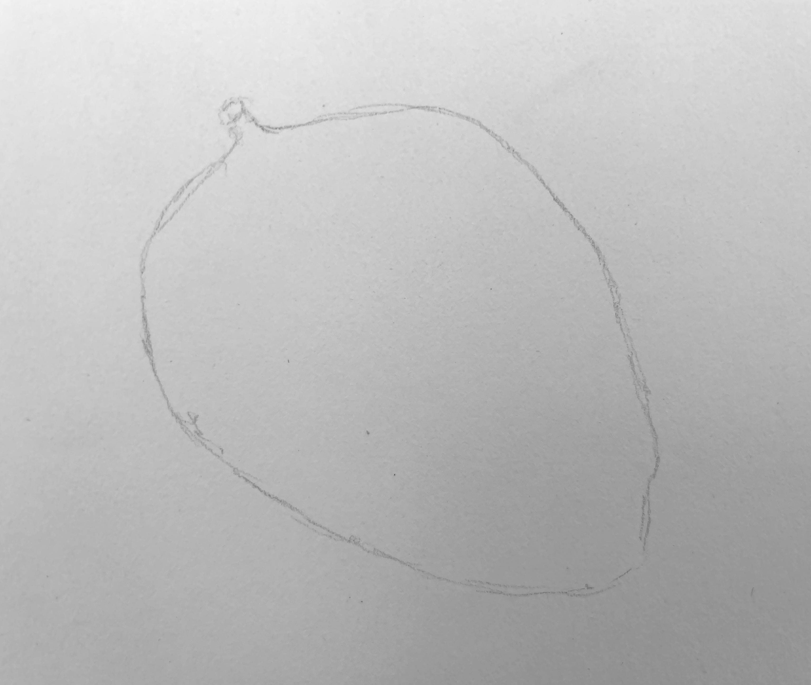
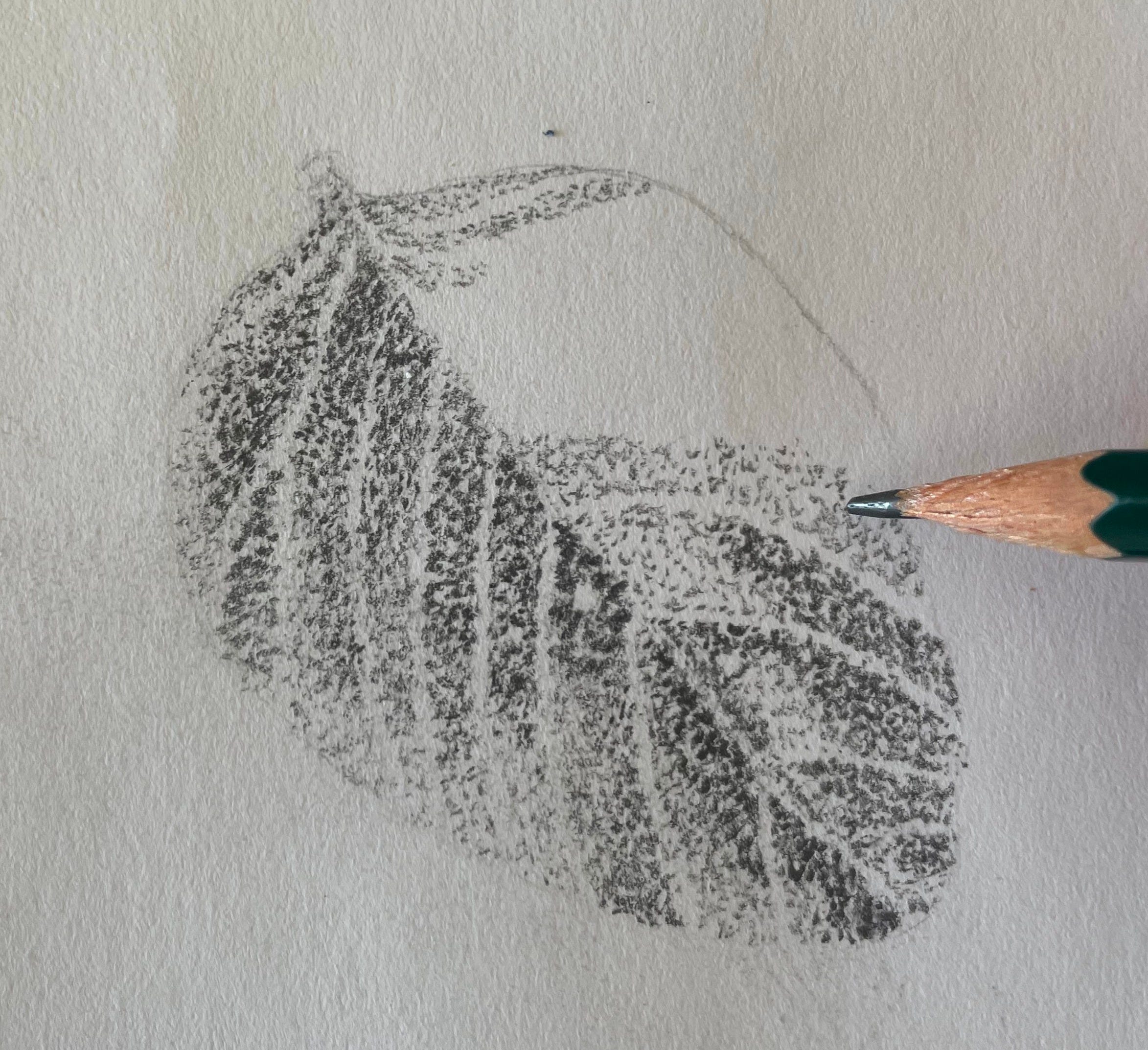
To start, select an object to draw and position it in front of you. For this demonstration, I will be using a French bean leaf. On your paper or sketchbook, begin by lightly sketching or stippling the outline with a 2H pencil. Personally, I prefer to sketch the initial outlines instead of stippling, then rub out the outlines as I start to dot in the area.
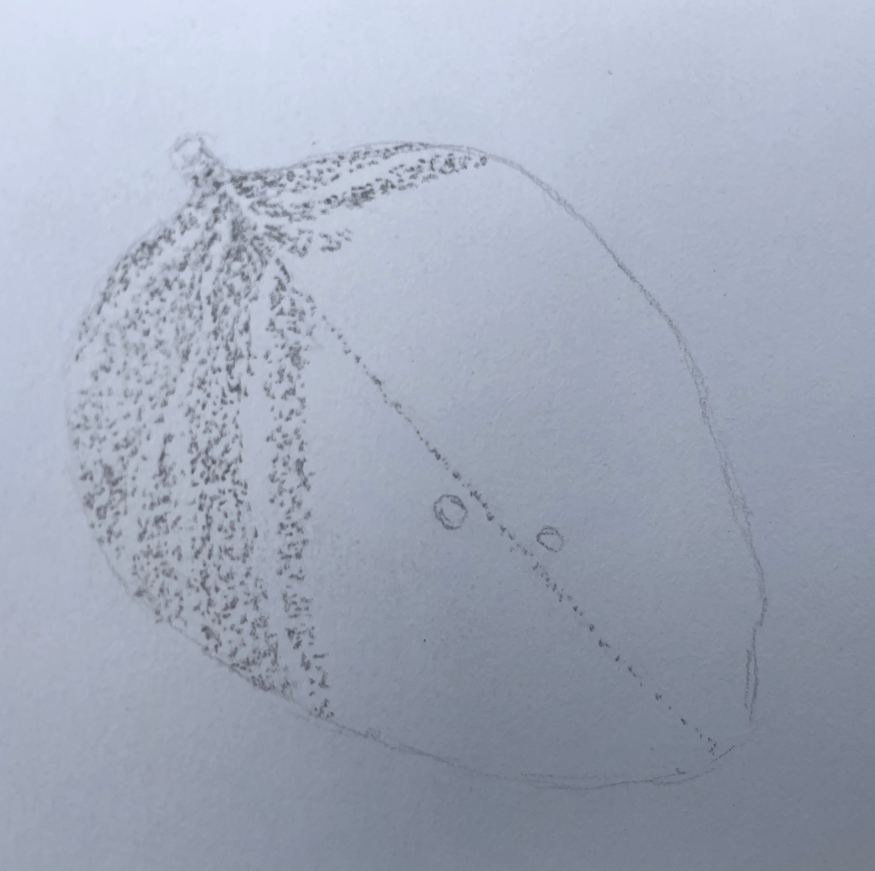
Examine the object closely to identify the varying tones: highlights, light tones, mid-tones, and dark tones, along with any defining lines or features. For instance, when working with a leaf, the main features is the midrib and numerous veins. I began by stippling the prominent midrib that runs down the centre which helped me section the leaf. Additionally, I noticed two holes (those bugs must be hungry), so I marked those in as well. After establishing the highlights, use the paper as your white space and refrain from adding any dots in those areas. Apply the lighter tones in the remaining sections using a 2H pencil.
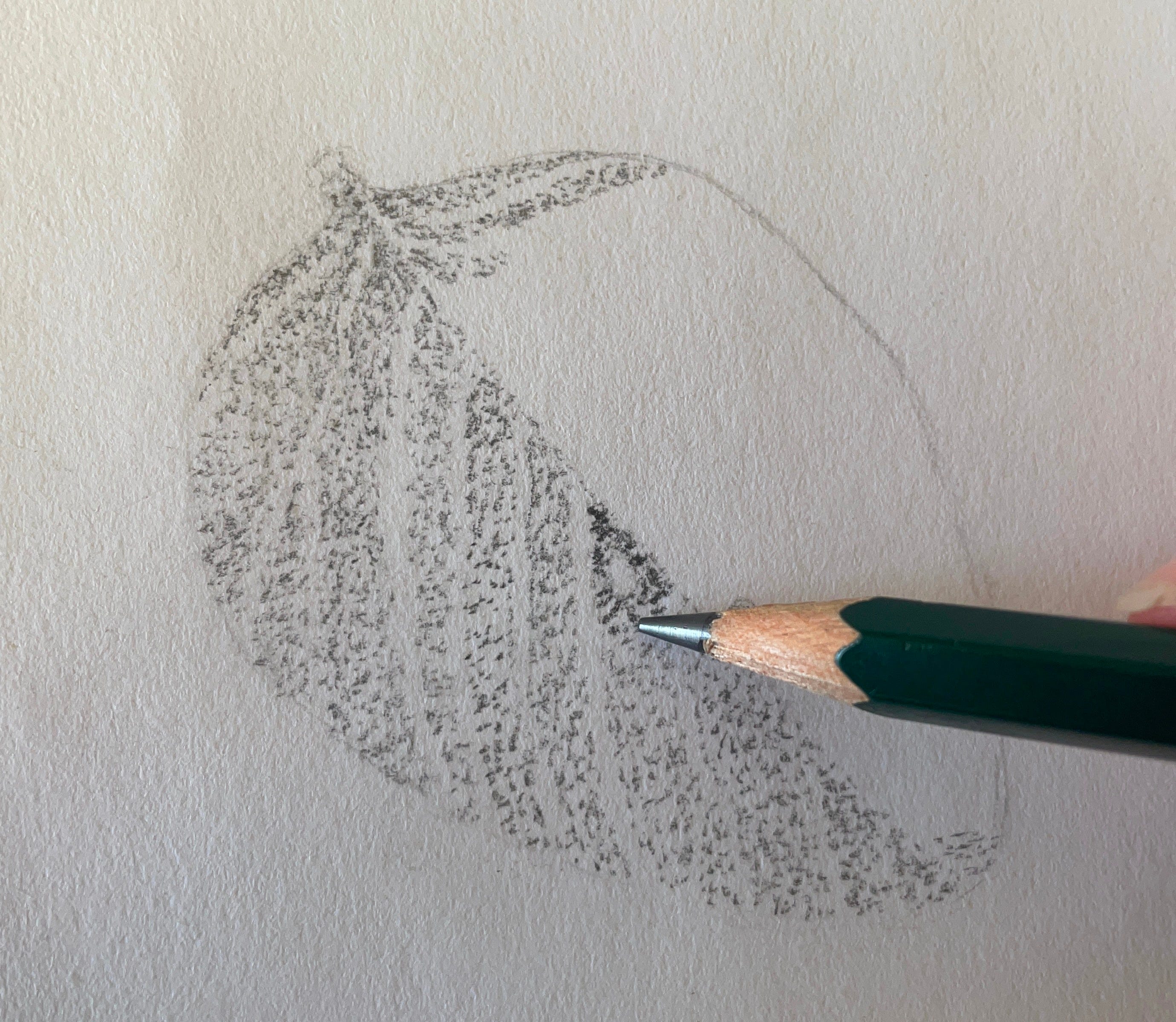
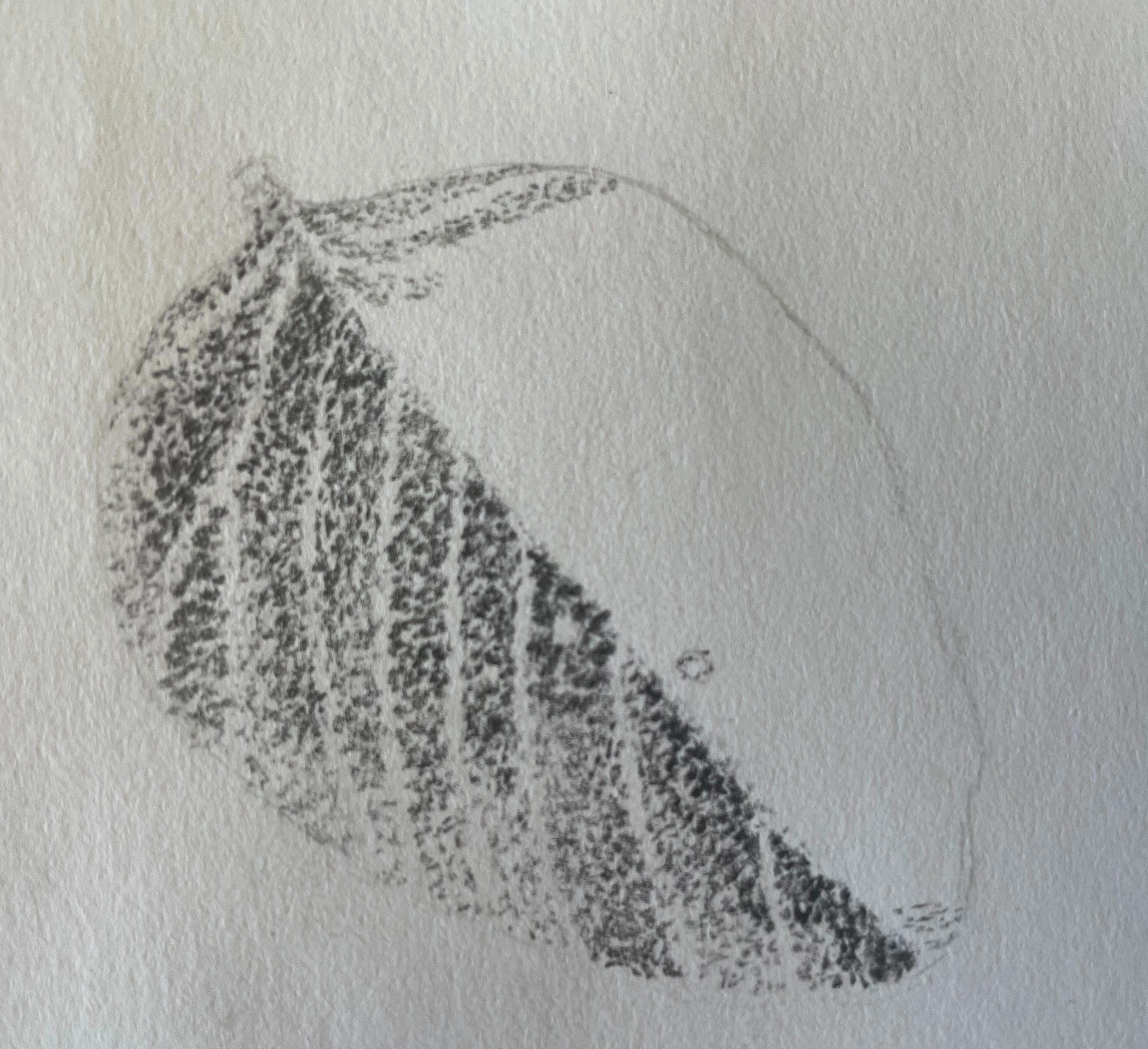
Once I completed one side of the leaf, I switched to a 4B pencil to enhance the mid-tones. I adjusted the pressure of my pencil, applying less force for lighter mid-tones and pressing harder for deeper shades.
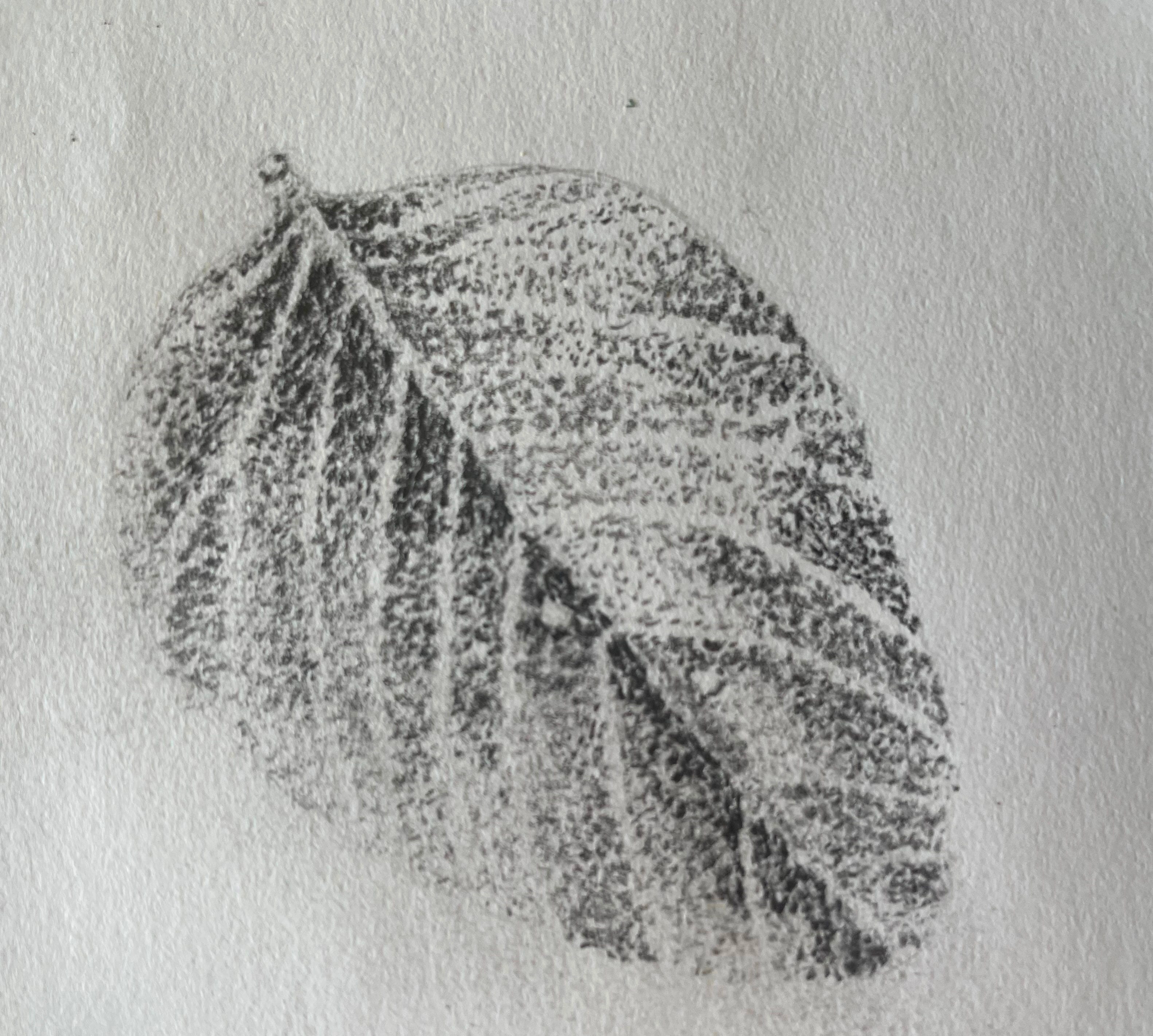
Once I finished with the highlights, light and mid-tones, I moved to the opposite side of the leaf. I tend to be a bit of a flitter in my artistic process. You might prefer to lay down all the 2H pencil first or tackle one section at a time until it's fully complete before moving on to the next area. It's important to embrace your own creative style; otherwise, you may find yourself feeling frustrated.
Once you have applied your lighter shades using the 2H pencil, move onto a 4B pencil to build up the mid-tones.
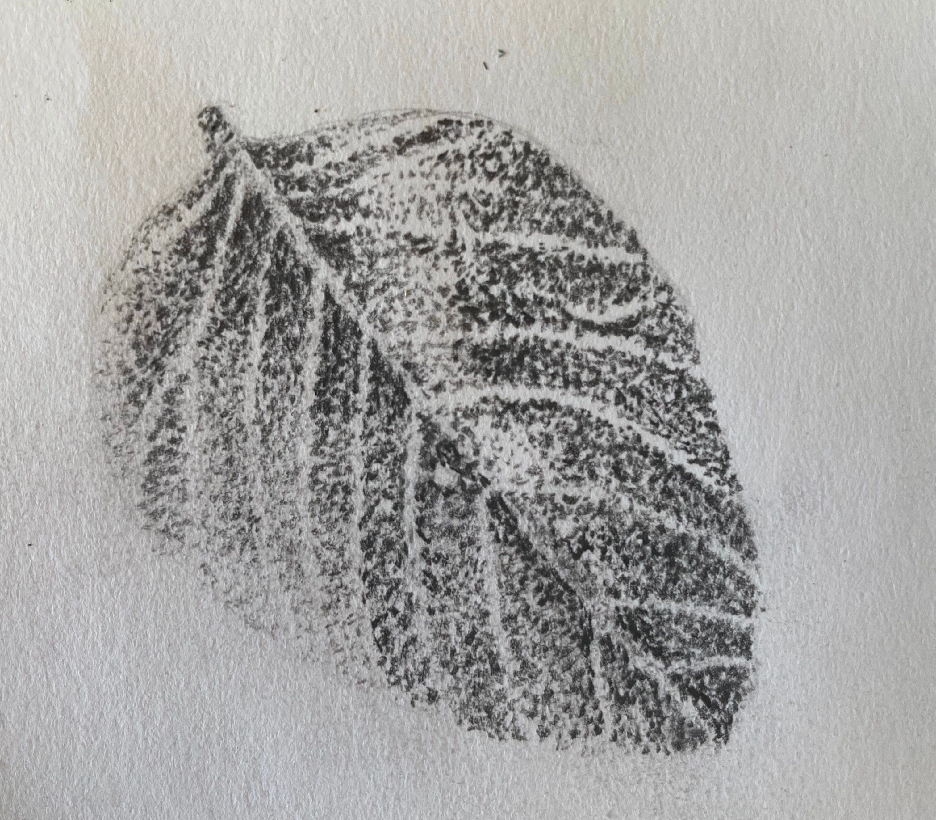
Using a 6B, 7B or 8B (I used an 8B) add in the dark-tones. This will start to make your drawing pop due to the broad contrast and also it will give the illusion that the object looks 3D.
Keep building up the tones working between 2H, 4B and 6-8B. Keep your dots dense for darker tones and further apart of lighter tones.
The idea with this drawing exercise is to explore the technique of stippling, so don’t go spending hours on it unless you want to. See whether stippling is something you enjoy…or not. It does come with practise, so you can repeat this exercise as many times as you see fit and with different still life objects.
After you have drawn your piece, journal or think about what worked well and think of one thing you could improve on. Take that step into your next piece of artwork to improve your skill.
See how you get on with your drawing and I’ll be back soon for the next Foundations to Flourish.
I will be massively overjoyed if you let me know how you get on in the comments. I love it when a comment pops through on my phone….it means I get to talk about art! ☺️
Enjoy creating,

